The Red Hat Effect: How a Simple Cap Became the Most Powerful Brand Symbol in America
In branding, few things are as potent as a visual cue. The Nike swoosh. Apple’s bitten fruit. Tiffany & Co.’s robin egg blue. In fact, these aren’t just logos—they’re vessels of identity, emotion, and ideology. In marketing terms, they’re semiotic shorthand: symbols that instantly communicate values, tribe, and intent.
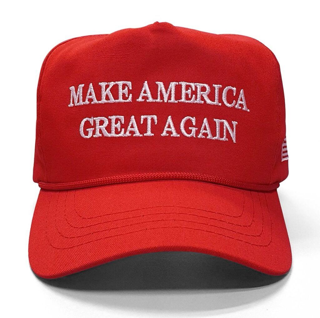
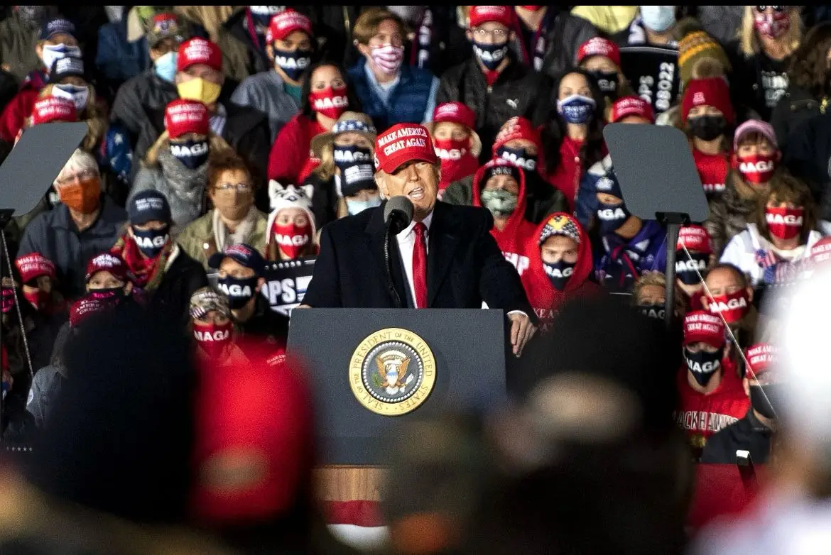
Now, add to that list one of the most unlikely—and emotionally explosive—symbols of our time: A $25 red baseball cap with white block lettering.
No ‘logo.’ No A list celebrity endorsement campaign. Just four words:
Make America Great Again.
It began as campaign merch. Soon after, it became a meme. Eventually, it evolved into a movement. However, now, it’s one of the most powerful brand symbols in modern political history. And whether you love it, loathe it, or you’re ambivalent about it. It works… Let’s explore how.
From Accessory to Ideology: The Red Cap’s Evolution
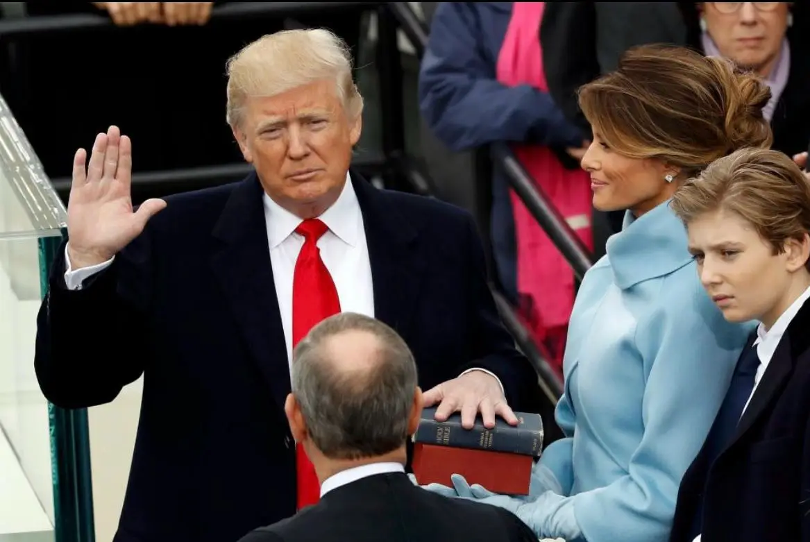
The slogan “Make America Great Again” wasn’t invented by Trump—Reagan used a version of it in 1980. However, Trump did what all brilliant branders do: he claimed it, packaged it, and wore it relentlessly.
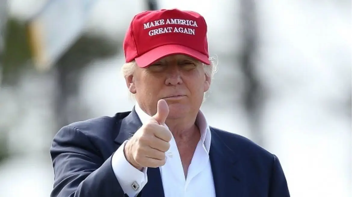
And he didn’t outsource that visibility. He devotedly wore the hat himself—not only at rallies, but also at press events, golf outings, and even in the Oval Office!
“It was such a simple and effective idea. The hat was a signifier—if you wore it, you were on his team.” – Michael Bierut, Partner at Pentagram
What began as promotional merch quickly became a badge of belonging—and eventually, a lightning rod for cultural division.
Why It Worked as a Brand Symbol
Red Isn’t Just a Colour—It’s a Statement
In U.S. politics, red is synonymous with the Republican Party. It’s not just eye-catching—it’s partisan. Add in its psychological triggers—energy, urgency, aggression—and it was the perfect visual for a populist message that thrived on emotion and spectacle.
In short, red doesn’t whisper. Red shouts. Think: Coca-Cola. Ferrari. YouTube. Supreme.
Typography That Signals Authority
In addition, the cap’s font isn’t a modern sans-serif or playful script—it’s a formal serif, reminiscent of government signage. It evokes authority and nostalgia, reinforcing the idea that this slogan isn’t just aspirational—it’s official.
Merch-as-Movement
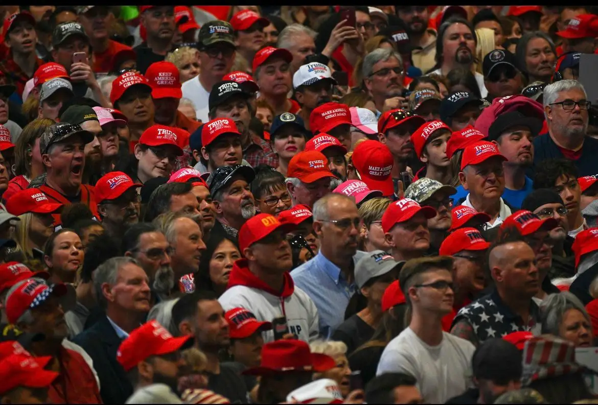
Trump’s campaign reportedly spent $1.8 million on MAGA hats during the 2016 election cycle alone. But it wasn’t just fundraising—it was brand proliferation. The hat was everywhere—on heads, on signs, in memes, and news cycles.
Repetition Builds Recognition
In branding, consistent placement breeds association. Trump didn’t just sell the hat—he wore it relentlessly, during times a traditional politician may have simply opted for a suit and tie, and fresh haircut. By making it a staple of his public image, Trump embedded the hat into the visual language of his campaign. But more importantly, he turned it into a uniform—not just for himself, for his supporters too. When crowds showed up wearing matching red caps, it created an immediate sense of belonging and identity. It wasn’t merchandise; it was membership.
This is how tribes are built: through visual uniformity. Think of Apple product launches, where devoted fans line up wearing branded T-shirts and clutching sleek devices that signal their loyalty. Or football fans donning shirts and scarves in team colours—it’s about signalling affiliation. Even in politics, similar tactics have worked before: Barack Obama’s successful 2008 campaign used the “Hope” poster and stylised ‘O’ logo across signs, buttons, and T-shirts to create visual cohesion. These symbols help people feel part of something larger, something with purpose. But, in Trump’s case, the hat wasn’t just branding—it became a badge of identity, solidarity, and political stance, all distilled into one wearable and affordable billboard.
From Symbol to Semiotic Minefield
Ultimately the true power of the MAGA cap lies not in design—but in interpretation.
By 2017:
Schools banned it for inciting conflict.
Protesters burned it as a symbol of hate. Meanwhile, celebrities wore it ironically—or provocatively.
What’s more, social media treated it like visual shorthand for division.
Brand Takeaway: When a brand symbol becomes culturally loaded, its creator no longer controls it. Culture does.
This is branding at its most volatile. And arguably, most fascinating…
Parallel Symbols That Became Cultural Code
The Che Guevara T-Shirt
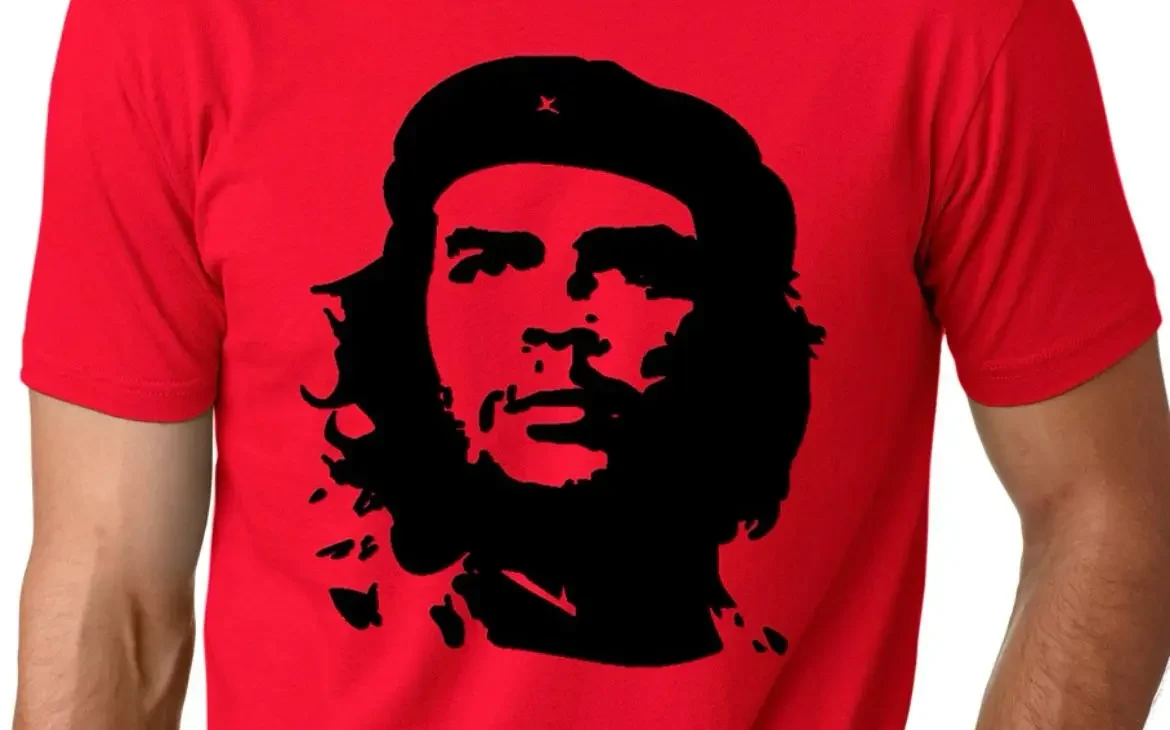
From revolutionary icon to global fashion statement, Che’s face now adorns t-shirts ironically made by the capitalist systems he fought against.
Brand Takeaway: Meaning isn’t fixed. It morphs through usage.
The Pink Pussy Hat
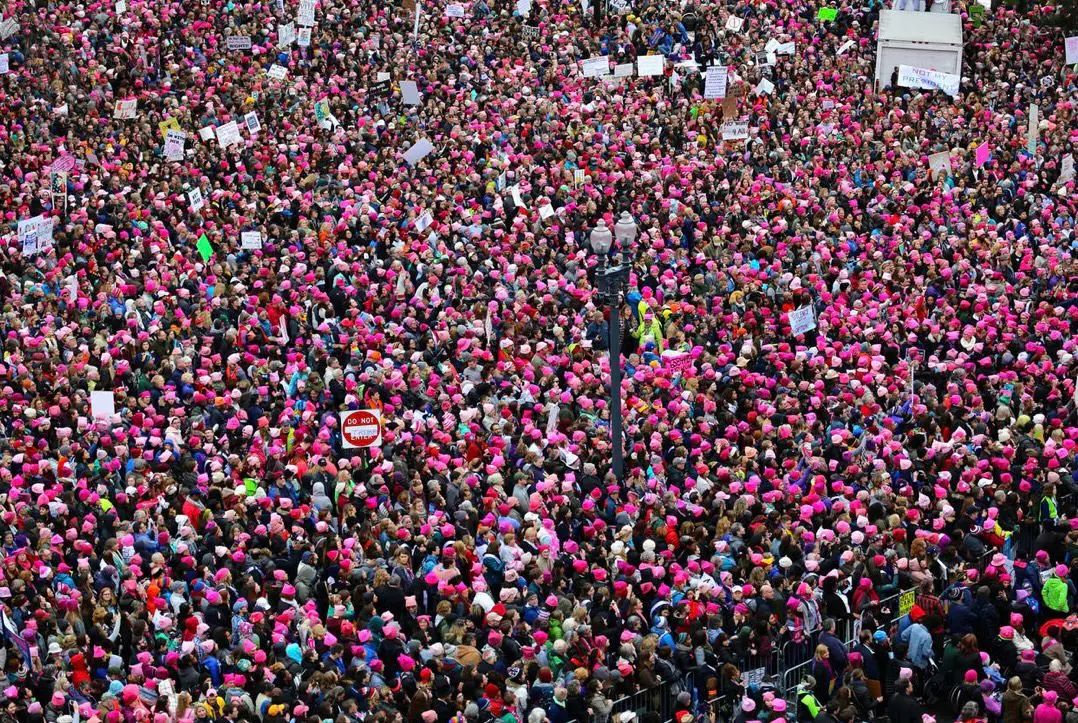
Born in the 2017 Women’s March, it became an international symbol of feminist resistance. Handmade, grassroots, unmissable.
Brand Takeaway: Wearable branding creates community.
The Guy Fawkes Mask
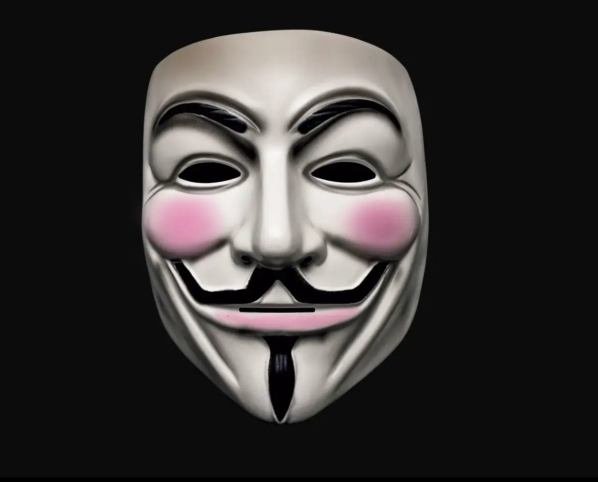
Popularised by V for Vendetta, then hijacked by Anonymous and Occupy Wall Street. It was originally linked to a failed revolution, but today it’s a symbol of digital protest.
Sales of the mask surged 7000% during the Occupy movement, according to Time Magazine.
The Guy Fawkes mask proves that the power of a symbol isn’t in its origin, but in the meaning people attach to it—cultural relevance is what makes a brand icon endure.
Brand Takeaway: Design catches the eye — meaning keeps it there
The High-Stakes Game of Brand Association
When a symbol gains momentum it becomes semiotic currency, but currency can be devalued—or sometimes, even weaponised.
That’s why many brands avoid overt symbolism. A misaligned image, colour, or context can turn branding into backlash.
Take Peloton, a brand built on sleek design, aspirational fitness, and a sense of progressive, community-driven lifestyle. In early 2021, Peloton faced unexpected blowback—not because of a marketing misstep or a controversial campaign, but because of a fleeting background moment during media coverage of the Capitol riots. A rioter was seen in a home gym, wearing a MAGA hat. But importantly, what was behind them? A Peloton bike.
This wasn’t intentional product placement. Instead, it was something far more damaging: brand contamination.
In an instant, Peloton’s carefully curated image—upscale, tech-savvy, socially conscious—was visually linked to a violent, anti-establishment event. The company had no control over the setting or the person, but the brand was implicated by proximity. That’s the power of symbols in branding. Simply put, the MAGA hat didn’t just signify political affiliation; it carried the emotional weight of division, extremism, and rebellion. And because the hat had become such a charged symbol, anything near it risked becoming collateral.
This moment illustrates a critical truth in brand strategy: context matters. A brand’s image isn’t just shaped by what it puts out into the world—it’s also shaped by where it shows up, how it’s used, and who is seen using it. When a brand becomes part of the visual landscape of controversy, even accidentally, it can face reputational fallout. In this case, the mere presence of a Peloton bike in a politically toxic scene triggered debates about who the brand caters to, what it represents, and whether its image was as inclusive and progressive as its marketing suggested.
Why This Matters for Designers, Creatives, and Brands
Symbols are powerful. But they aren’t blank canvases. Here’s what brand leaders must remember: colours carry context—especially red, blue, pink, and black. These particular colours are important for context in branding because they’re deeply embedded in cultural, emotional, and psychological associations. They don’t just attract attention; they carry meaning, often shaped by history, media, politics, and societal norms.
Repetition builds identity. Over time, once a symbol becomes habitual, it becomes habit-forming.
Audience defines meaning. The creator sets the intention—but it’s the audience who writes the story.

Once it’s in the wild—you don’t own it anymore. Culture does.
So… Should Brands Embrace Symbols?
Sometimes, yes—if you’re ready to stand for something. Symbols are powerful. They simplify complex identities into something instantly recognizable, emotionally charged, and easily shareable. When used intentionally, they can galvanise communities, attract loyal audiences, and turn casual consumers into passionate advocates. Think of the rainbow flag, which transformed from a piece of fabric into a global symbol of LGBTQ+ pride and solidarity. But with that power comes responsibility. Symbols aren’t just aesthetic choices—they’re declarations. When a brand adopts or aligns with a potent symbol, it signals values, beliefs, and boundaries. And that can be both unifying and polarising.

Take Ben & Jerry’s, for example. The brand has consistently used its platform—and even its packaging—to champion progressive causes like Black Lives Matter, climate justice, and criminal justice reform. Their stance isn’t subtle, and neither are their symbols. They’ve launched limited-edition flavours like “Justice ReMix’d” and released bold visual campaigns that align with activist movements. It’s a strategy that alienates some, but it fiercely bonds others. Their brand becomes more than ice cream—it becomes a political statement, a badge of shared values.
On The Flip Side
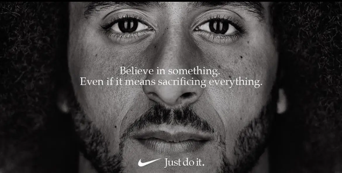
Nike’s decision to feature Colin Kaepernick in its 2018 campaign was a masterclass in calculated risk. The tagline—“Believe in something. Even if it means sacrificing everything.”—wasn’t just about the athlete. It was Nike taking a side in a heated national debate about race, patriotism, and protest. The backlash was immediate: people burned their trainers in protest. But so was the reward. Nike’s sales surged, and the brand deepened its connection with a younger, more socially conscious demographic. The Swoosh wasn’t just a logo anymore—it was a flag.
Symbols are shortcuts to meaning. But they also polarise because they force clarity. A red hat, a raised fist, a rainbow flag—these visuals don’t just tell you what a person (or brand) supports; they tell you what they don’t. So, if a brand chooses to embrace a symbol, it must do so with full awareness: you’re not just attracting your people—you’re also drawing a line in the sand.
In short, symbols are powerful branding tools—but they’re not neutral. If you choose one, be ready to defend it, stand behind it, and speak through it. Because once it’s out there, it speaks for you.
Conclusion: A Hat Is Never Just a Hat
At Hera Creative Design, we live and breathe the language of symbols. Because great branding isn’t just visual—it’s visceral. It doesn’t just look good—it means something. Every decision, from a logo’s curve to a colour’s tone, has the power to shape perception, stir emotion, and spark allegiance.
Consequently, that’s why our Managing Director, Martyn, wears his custom Hera merch and Hera cap to work, to client meetings, to creative sessions.
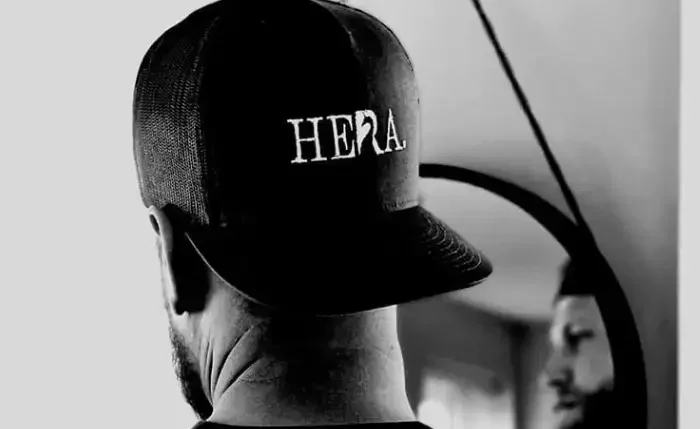
It’s about visibility. It’s a cue. A constant. A graphic shorthand that connects him to the brand and signals what we stand for: clarity, creativity, and confidence. People notice. They ask. They remember. That’s not just merchandise. That’s brand architecture in motion.
Our own symbol—the peacock—is no accident either.
Inspired by the goddess Hera, this emblem speaks to beauty, pride, and purposeful individuality. Every feather is different, just like every client we work with. But when revealed together, they form something bold, unmistakable, and unforgettable. In myth, Hera placed the eyes of her watchman, Argus, onto the peacock’s tail—a symbolic act that turned grief into legacy, presence into power. That’s the essence of branding: turning story into symbol and meaning into memory.
While cut from a different red cloth, the red MAGA hat stands as an equally potent lesson in symbolic branding. In fact, it proves that even the simplest visual—a block-lettered slogan on a red cap—can carry seismic cultural weight. It wasn’t just apparel. It was a flashpoint, a battle cry, a boundary line. Adore it or Abhor it, the hat worked because it was loud and clear. It told a story at a glance and sparked an emotive reaction. Above all, that’s what the most enduring brand symbols do: they declare, they divide, they define.
But as we’ve explored, once a symbol enters the world, it takes on a life of its own. It can’t be controlled, only interpreted. Culture decides what it means. And the stakes are high—because when a symbol becomes iconic, it doesn’t just represent a brand. It is the brand.
So, before you wear a brand, adorn a symbol, or print your business logo on a tote bag or stitch it into a cap, ask yourself:
What does this really say? Who will it resonate with? And who might it alienate?
Because branding isn’t neutral. Every choice signals something.
In the end, the most powerful brands don’t just make a mark.
They make meaning.
Create movements.
And they leave no doubt.
Therefore a hat is never just a hat. It’s an insignia. A signal flare. A story waiting to be told.
Ultimately when wielded with intention, the right symbol can shape culture, spark conversation, and stand the test of time. A red hat with bold white letters didn’t just spark conversation; it reshaped history. It didn’t just make a statement — it made a president.