
When we first engaged with the team over at RPL Construction, they were in need of guidance on how to increase their brand awareness. We conducted a brand audit and looked at particular things like, how does their website function? Do they have a content strategy in place for their social media? Is the brand responsive and adaptable for all platforms?
Revitalizing the RPL Construction Brand: A Comprehensive Transformation
After conducting an in-depth analysis of the RPL Construction brand, we identified several key areas where improvements could improve the brand’s impact and consistency. Our approach was strategic and thorough, focusing on strengthening the brand’s identity while preserving its core heritage and emotional significance.
Refining the Brand Identity
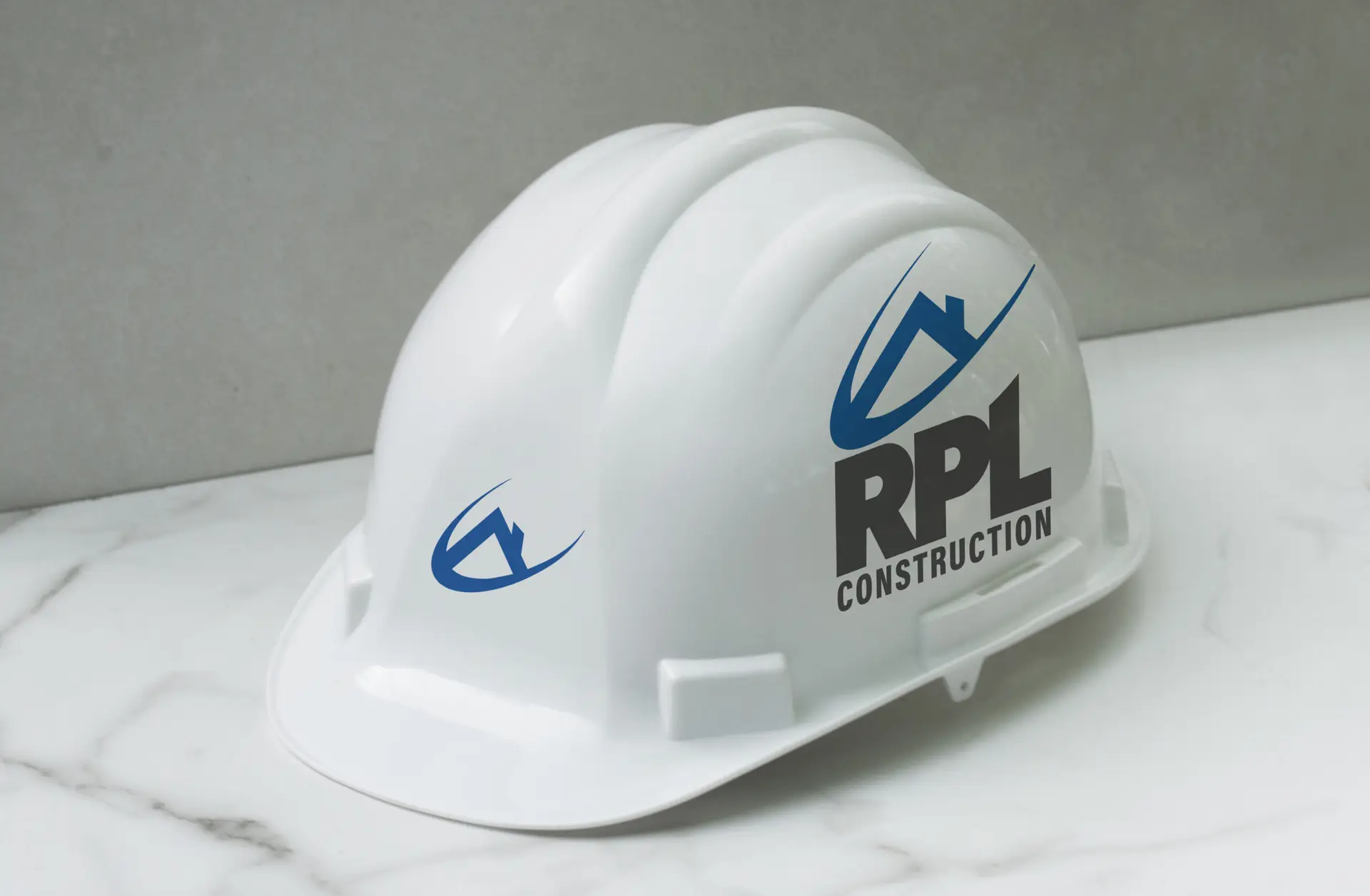
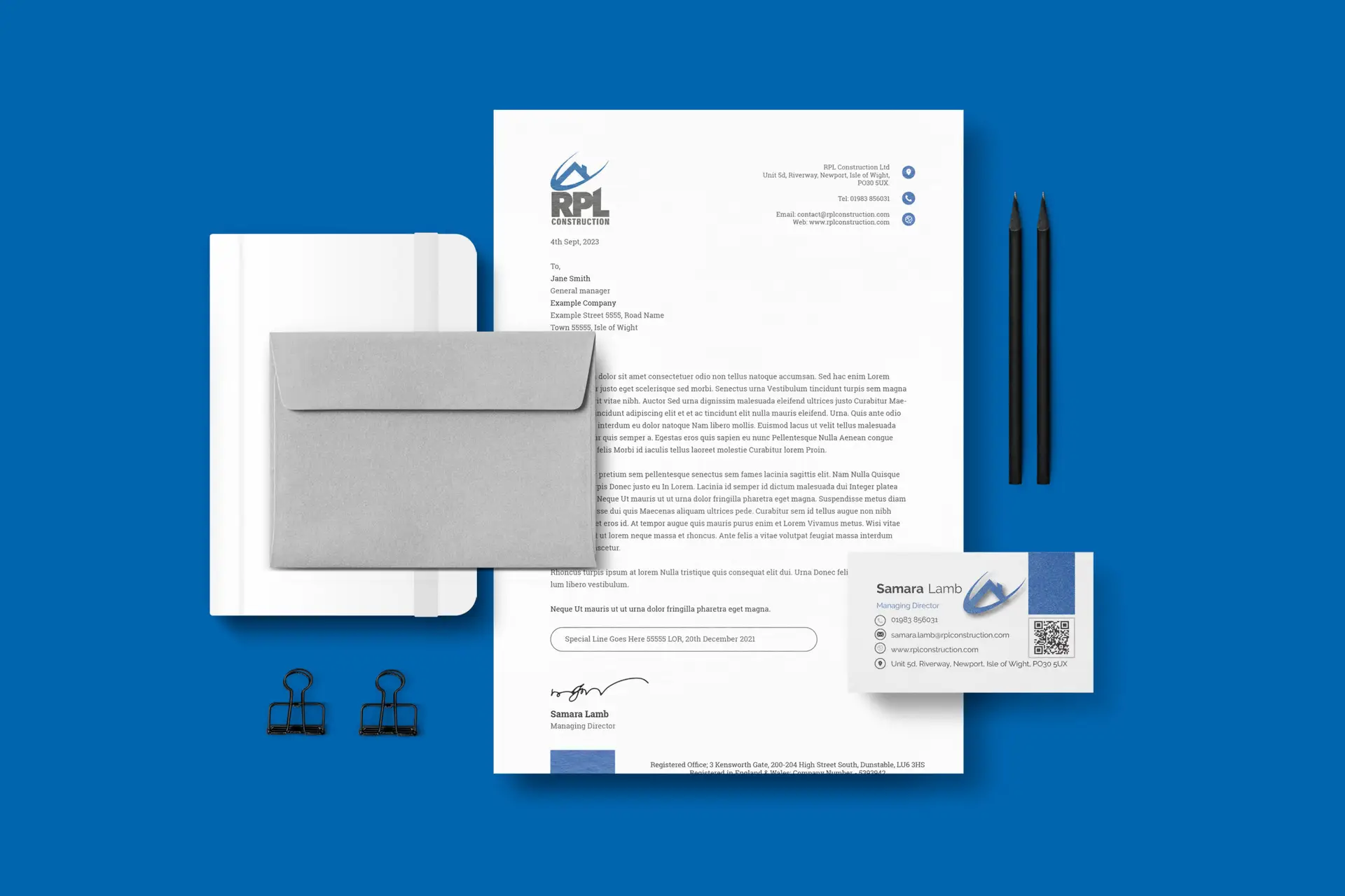
We began with the brand identity, making thoughtful adjustments to ensure the brand could be seamlessly implemented across all platforms — both digital and print. A key part of this process involved refining the existing logo. Since the original logo was a collaborative creation between the current Managing Director, Samara, and her late husband, Nick, we knew how important it was to respect its legacy. Rather than making drastic changes, we carefully rescaled and adjusted certain elements to enhance balance and versatility without compromising its original essence.
Establishing a Cohesive Visual System
With the refined logo in place, we moved on to building a comprehensive visual identity system. This included:
✔ Curating a Brand Colour Palette – A carefully selected colour palette that reflects the brand’s personality and enhances recognition across platforms.
✔ Defining Brand Typography – Establishing a clear and modern typography system to maintain consistency in all communications.
These elements were then compiled into a detailed Brand Guidelines Document — a crucial tool to maintain brand consistency. The guidelines outlined best practices for brand application, including:
Correct logo usage and placement, with appropriate breathing space.
Text hierarchy to guide the audience’s focus and ensure the most important messages stand out.
Uniform design standards for both internal and external communications.
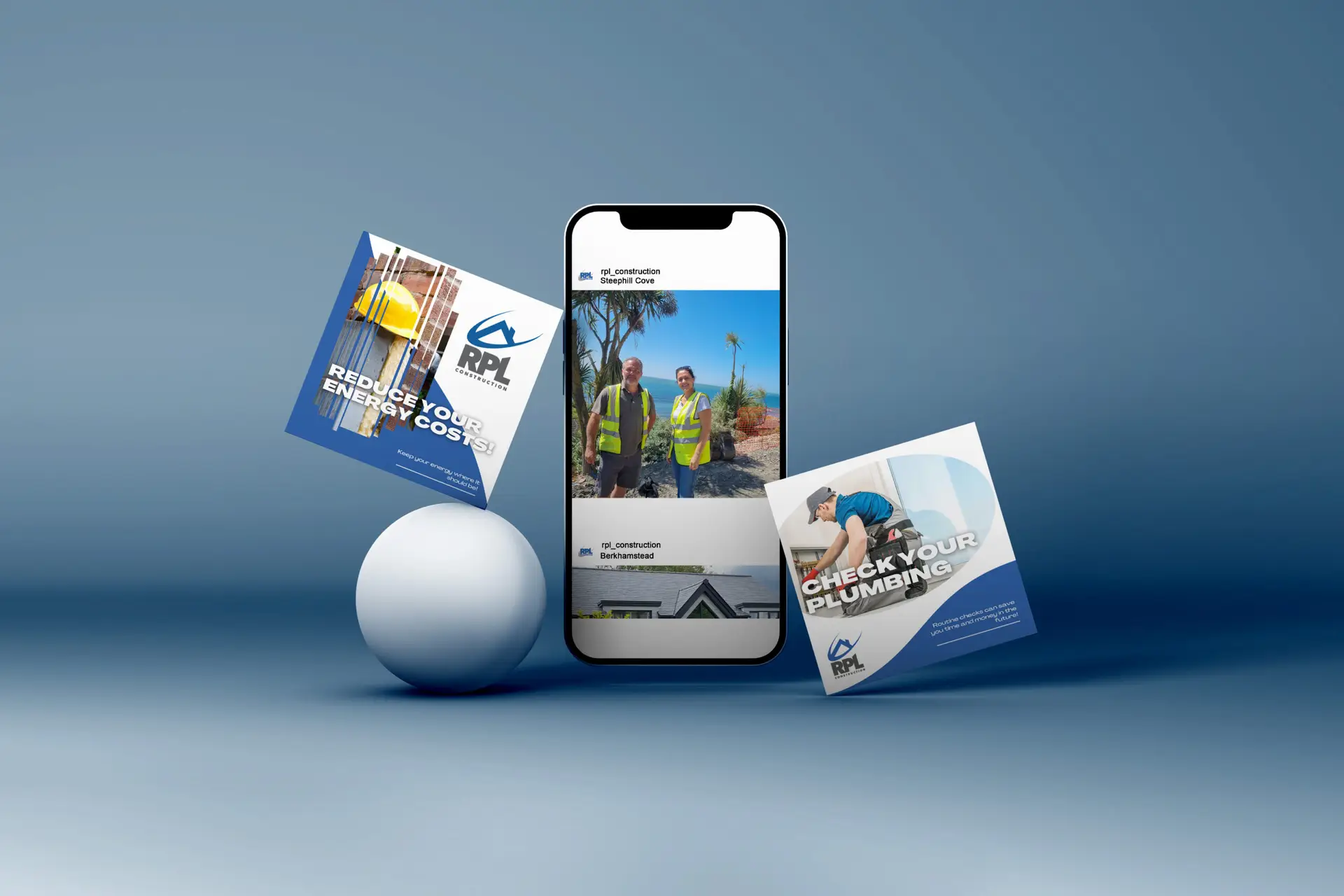
Developing Professional Brand Assets
With a strong foundation in place, we were able to create a full suite of branded assets, including:
Social Media Templates – Professionally designed templates to maintain visual consistency across all platforms.
Business Cards – Sleek, professional cards reflecting the updated brand identity.
Advertising Materials – High-quality designs for both digital and print advertisements.
These assets allowed RPL to project a consistent, polished image in every interaction, reinforcing the brand’s authority and professionalism.
Crafting a Growth-Oriented Brand Strategy
Armed with a cohesive identity and professional assets, we developed a powerful brand strategy aimed at increasing visibility and engagement. This strategy was designed to amplify RPL’s presence, build trust, and establish a strong market position.
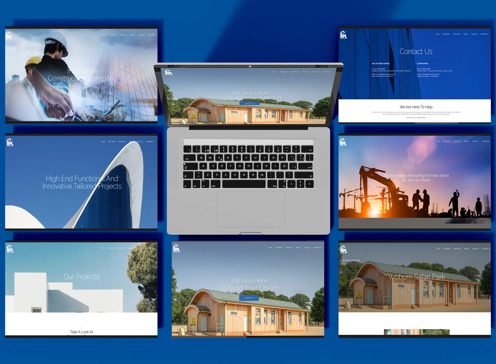
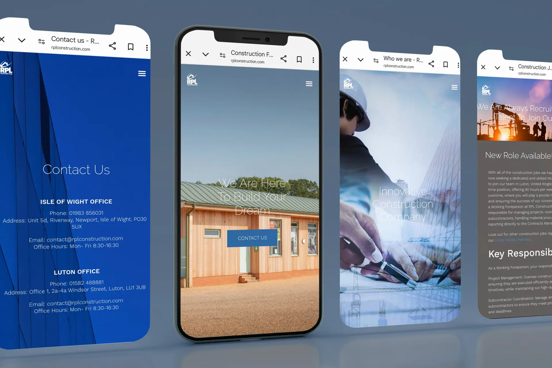
Revamping the RPL Website
A major part of the transformation was the complete redesign of the RPL website. We overhauled the entire site, creating a sleek, modern interface that not only looks more professional but also sets RPL apart in a sea of generic industry websites. The new site delivers a user-friendly experience, with intuitive navigation and strong visual appeal — essential for capturing and retaining audience interest.
Measurable Results
The impact of our strategy was nothing short of remarkable:
✔ 495% Increase in brand following
✔ 550% Growth in impressions
✔ 328% Boost in audience interactions
These impressive metrics reflect the strength of the new brand foundation and provide a solid platform for sustainable growth and long-term brand authority.
The transformation of RPL Construction’s brand is a testament to the power of strategic design and consistency. By respecting the brand’s history while adapting it for modern platforms, we’ve created a lasting identity that positions RPL for ongoing success.