

How a Gritty TV Show Became a Cultural Icon
Few television shows have achieved the level of cultural dominance that Breaking Bad has. What started in 2008 as a risky, low-budget drama on AMC evolved into one of the most powerful entertainment brands of the 21st century. From the desert-scapes of Albuquerque to the steel blue of Walter White’s product, Breaking Bad didn’t just tell a story—it built a brand so potent, it continues to shape pop culture and business thinking over a decade later.
On the surface, it’s a gripping drama about a man’s descent into darkness. But beneath the meth labs and moral crises lies something just as meticulously engineered: a masterful exercise in branding. From character arcs to colour palettes, every element of the show contributes to the creation of one of the most compelling brand narratives in modern television.
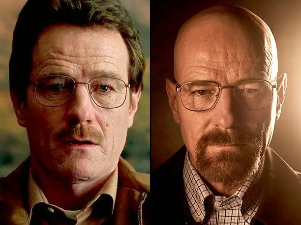
Walter White doesn’t just change — he rebrands.
The show doesn’t just tell a story—it builds a brand identity as distinctive and powerful as any Fortune 500 campaign. Whether it’s through the psychological pull of archetypes, the symbolism of colour, or a single, unforgettable line, Breaking Bad demonstrates how great storytelling and strategic branding are often one and the same.
This article explores Breaking Bad not simply as a television series, but as a tactical blueprint in world-building, visual identity, character design, consistency, emotional engagement, and longevity. It’s a study in what happens when story and brand fuse at a molecular level.
A Brand Built on Contradiction: The Duality of Walter White
At the heart of Breaking Bad lies a compelling contradiction—mild-mannered chemistry teacher turned drug kingpin. The transformation of Walter White into Heisenberg isn’t just gripping television; it’s a brand narrative.
Great brands are built on strong, clear archetypes. Walt is the perfect Ruler meets Outlaw
archetype. He wants control and legacy—but achieves it by breaking every rule. This tension creates emotional complexity, which in branding terms, builds stickiness. Brands that tap into dualities (think Nike’s athleticism vs. rebellion, or Apple’s design vs. disruption) generate intrigue. Walt is no different.
His descent into darkness is not just a plotline—it’s the journey of a brand in transformation.
When Breaking Bad aired its gripping finale to a record-breaking 10.3 million viewers and later racked up over 500 million streaming hours in the first half of 2023 alone, it was
clear that audiences didn’t just watch the story unfold—they went along for every twist, turn, and moral spiral of the ride, witnessing not just a narrative arc, but a bold demonstration of how a brand can evolve into an iconic force.
Few lines in television carry the weight—and brand clarity—of this one: “I am not in danger, Skyler. I am the danger.” — The essence of Heisenberg’s brand, distilled.
In that moment, Walter White doesn’t just speak; he positions. The line is more than dialogue—it’s a mission statement. It signals the full emergence of the Heisenberg brand: bold, unapologetic, and
rooted in control through intimidation. It’s a brand voice sharpened to a point—where once there was hesitation, now there is absolute certainty.
For brand strategists, it’s a reminder that voice isn’t just what a brand says—it’s how it asserts identity, ambition, and intent. Heisenberg isn’t reacting to the narrative; he’s driving it, branding himself as the force to be reckoned with. This is how powerful brands are made: not through consensus, but through conviction.
Visual Branding: The Strategic Power of Colour in Breaking Bad
Colour isn’t just aesthetic—it’s a brand asset. In Breaking Bad, colour functions like a visual logo system, carefully calibrated to communicate identity, emotion, and meaning without a word spoken.
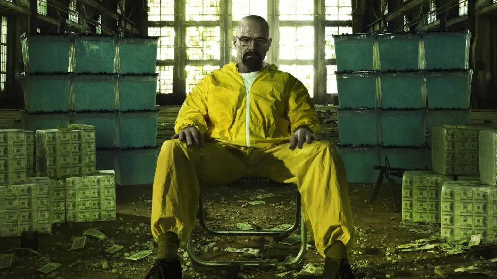
The most iconic example? The ultra-pure, crystalline blue meth. It isn’t just a product—it’s a branded experience. Within the show’s universe, that particular shade of blue becomes a mark of quality,
innovation, and fear. That’s brand equity in action: a fictional product so visually distinctive it becomes synonymous with the character who made it.
But Breaking Bad’s visual branding doesn’t end there:
• Green is Walt’s signature shade—from his bland wardrobe to the chalkboards and his worn- out car. It’s the colour of ambition masked as mundanity, and ultimately, of moral decay.
• Yellow cues toxicity and risk—seen in the hazmat suits, drug labs, and cartel scenes. It’s a visual shorthand for caution, volatility, and high stakes.
• Purple envelops Marie’s world, underscoring her obsession with control and false order—a brand of denial dressed in regal tones.
This isn’t random set design; it’s brand storytelling through a controlled palette. Just as Tiffany & Co. owns robin’s-egg blue and Coca-Cola commands red, Breaking Bad crafts a visual identity system where colour drives perception and emotional resonance. It’s a masterclass in how to use brand colour not just for recognition—but for meaning.
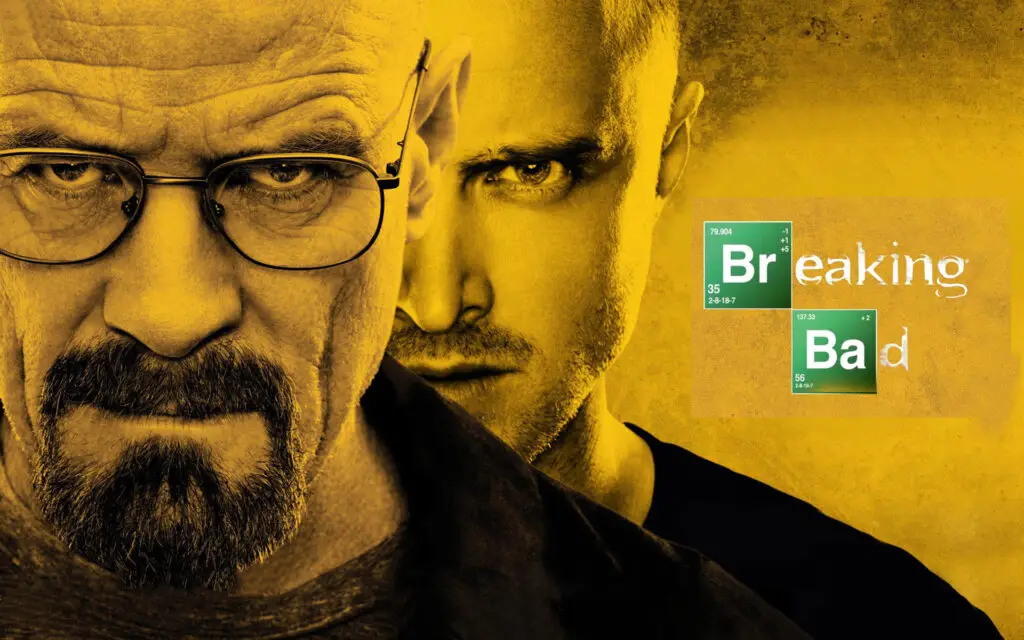
The Logo: Minimal, Scientific, Memorable
The show’s title treatment is a lesson in brand typography. “Breaking Bad” is stylised using elements from the periodic table—Br and Ba. Simple, brilliant, and instantly recognisable. It bridges the show’s themes of chemistry, science, and transformation.
This design becomes a shorthand for the brand. Even people who haven’t watched the show recognise the green elemental boxes. It’s the kind of logo that doesn’t just label the brand—it communicates it.
Content Consistency and Brand Voice
Consistency is the backbone of any powerful brand—and Breaking Bad delivers it with precision. From its script to its cinematography, every element is tightly aligned in tone, pacing, and purpose.
This is brand coherence at its finest.
- Tone of Voice: Clinical, darkly humorous, and emotionally charged, the show’s dialogue reflects a brand voice that’s intelligent, restrained, and ruthlessly honest. It speaks with clarity, never resorting to melodrama, and trusts the audience to keep up.
- Cinematography: Wide-angle shots, symmetrical framing, and unexpected camera angles are more than aesthetic choices—they’re visual branding devices. They communicate isolation, control, and tension, reinforcing the emotional palette of the show.
- Pacing: The deliberate, slow-burn storytelling structure—punctuated by shocking turns—mirrors Walter White’s transformation. It’s a strategy of restraint: revealing, not
rushing. In branding terms, it’s long-form storytelling that earns attention and rewards loyalty.
The result is a brand experience that feels cohesive, deliberate, and psychologically credible.
Audiences trust Breaking Bad not just because of what happens—but because of how it happens. It never breaks its own rules or tone. It knows exactly what it is, and that unwavering clarity is the hallmark of great brand design.
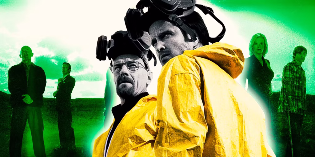
Merchandising and Brand Extension
One sign of a powerful brand is its ability to extend beyond its original format. Breaking Bad has done this effortlessly:
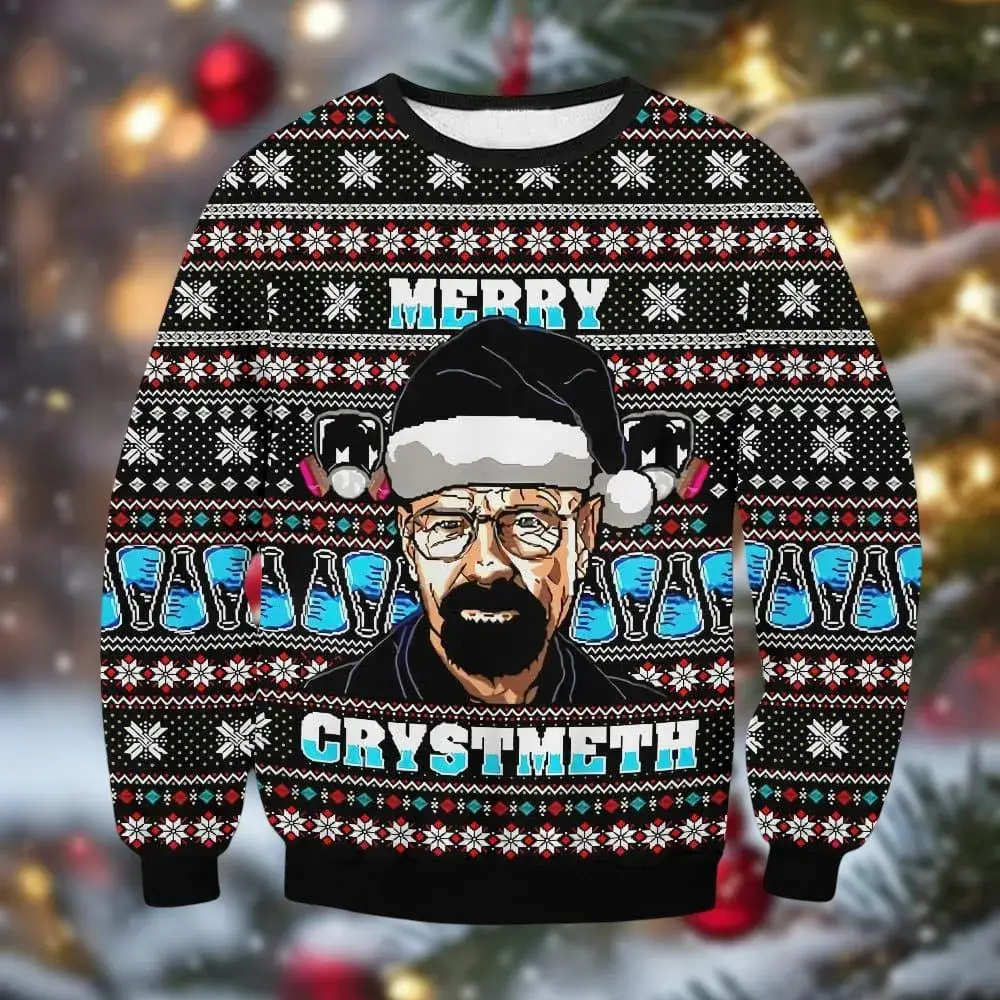
- Merchandise: From Funko Pops to Heisenberg hats, mugs, T-shirts, and even “blue rock candy” meth replicas sold in stores.
- Spin-Offs: Better Call Saul is more than a spinoff—it’s a strategic brand extension that deepened the original universe without diluting it.
- Pop-Ups and Immersive Experiences: Breaking Bad-themed cafés, fan tours in Albuquerque, and interactive experiences keep the brand culturally alive.
This level of brand licensing and experiential marketing is rare for a drama series. But Breaking Bad shows that if you build a world with integrity and detail, fans will want to live in it long after the final credits roll.
The Brand’s Emotional Hook: Transformation as Wish Fulfilment (and Horror)
At its core, Breaking Bad sells an emotional truth: the fantasy of breaking free from mediocrity, seizing power, and controlling your destiny. That’s a seductive message.
Brands that resonate emotionally—whether they promise freedom (Harley-Davidson), rebellion (Diesel), or self-actualisation (Nike) command loyalty. Breaking Bad taps into the same psychological real estate. It’s aspirational, until it’s terrifying. That arc—hope turned horror—is part of what makes the brand unforgettable.
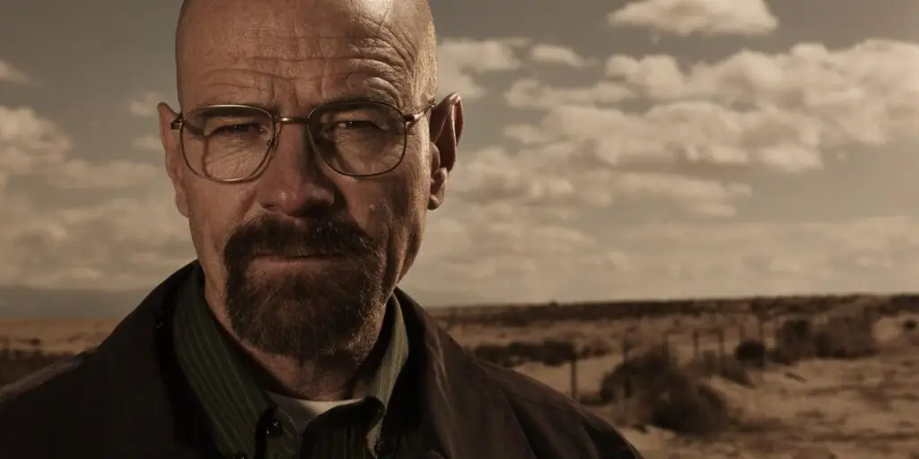
Heisenberg: Personal Branding at Its Darkest and Sharpest
Walt doesn’t just undergo a character shift—he engineers a personal brand. Heisenberg isn’t a pseudonym. It’s a constructed identity designed for dominance and fear.
- The name (a nod to the Heisenberg Uncertainty Principle) signals intellect and danger.
- The look—the black pork pie hat, the glasses, the goatee—is visual branding. As recognisable as Steve Jobs’ turtleneck or MJ’s glove.
- The voice: Minimal, chilling slogans like “Say my name” and “I am the one who knocks” function like ad taglines—short, unforgettable, and emotionally charged.
- And his product—the blue meth—is a lesson in product branding. It’s high-quality, visually distinct, and becomes instantly associated with Heisenberg. He doesn’t just make meth—he redefines it. Like Tesla in the EV market or Dyson in vacuum tech, he turns function into fascination.
In essence, Walt doesn’t just “go to market”—he owns the market. He builds an empire through narrative, design, and ruthless consistency. That’s brand strategy in action.
Legacy Branding: A Case Study in Long-Term Relevance
More than a decade after its 2013 finale, Breaking Bad continues to thrive—not just as a show, but as a brand with enduring cultural equity. It’s a standout example of legacy branding done right, offering valuable lessons for any business looking to build long-term relevance.
- Timeless Brand Pillars: Built around universal themes—morality, ambition, survival, and family—the brand narrative remains resonant across generations and markets.
- Organic Growth Over Flash: Rather than relying on high-budget, hype-driven campaigns, Breaking Bad scaled through credibility and word-of-mouth demonstrating the power of substance over noise.
- Platform Agility: Its migration to streaming platforms extended the brand lifecycle, unlocking fresh audiences and new engagement channels. This adaptability allowed the brand to evolve without diluting its identity.
- The result? A brand with a lasting halo effect—one that continues to generate social content, academic discussion, and cultural relevance well beyond its original run. In branding terms, Breaking Bad isn’t just a product of its time—it’s a textbook example of sustained brand relevance.
Lessons for Brands Outside Hollywood
So, what can non entertainment brands learn from Breaking Bad?
- Build a Strong Archetype: Your brand should stand for something clear, even if it’s complex.
- Design with Intent: Colour, typography, voice—every detail tells a story.
- Embrace Transformation: A brand that evolves strategically keeps audiences engaged.
- Create a World: The more immersive your brand universe, the more fans will invest.
- Consistency Is King: Every interaction should feel like part of the same story.
Final Thought: Branding Is Chemistry
Just like Walt’s meth empire, branding is chemistry—mix the right elements, maintain purity, control the reaction, and you create something unforgettable. But nowhere is this truer than with Heisenberg. Walt didn’t just create a product—he built an identity, a myth, and a monopoly. The blue meth wasn’t just chemically pure—it was branded. His look wasn’t just a disguise—it was a logo. His words weren’t just dialogue—they were slogans.
Breaking Bad didn’t just break television norms—it built a brand that fused storytelling, visual identity, emotional resonance, and strategic growth into something explosive. For creatives, marketers, and brand strategists, it’s more than a show. It’s a blueprint.
Want help creating a brand that’s pure, powerful, and unforgettable? Get in touch, because Breaking through isn’t luck—it’s strategy. At Hera Creative Design, we don’t do quiet.
Written by

Rebecca Herbert-Thorp
Head of Operations | Training Director